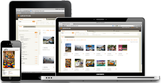
There are over 4.5 billion mobile phone subscribers in the world, but only 10% of them use smartphones. As 3G Internet coverage spreads and prices drop (a budget smartphone can be had for under $100 today), the significance of making your website accessible to mobile users is critical.
Responsive website design is the technology of the future. It’s the middle ground between ‘traditional’ websites that are optimized for desktop computers, and mobile websites that are generally viewed via smartphones. Responsive website is a solution that adapts to different screen widths. Flexible grids and advanced styles are used to present identical content, but the layout automatically adjusts to the screen width of user’s device.
While responsive design may not be a universal solution, it is clearly a good option for some of the following reasons:
- relatively low cost (instead of creating a standard website and its mobile version, only a responsive website is built. While the latter option requires on average 25% more resources, it’s still faster and cheaper than the former, bringing us to the next point…)
- excellent option for starting from scratch (rather than committing resources to building a separate mobile app in addition to the website, it’s first possible to make sure the project is successful and sacrifice none of the mobile users in the process. With this technology, your startup risk is reduced considerably as you can postpone additional investment until your main website accomplishes a certain goal);
- your website will work even with new devices (the need to update a mobile website which by definition recognizes the user’s device, is a disadvantage compared to a responsive website which only recognizes the width of the browser).

We will create a master template and wireframes for your responsive website. We will make sure to communicate with you as often as necessary to ensure user goals are considered and design is beautiful and functional on as many screen types as needed.
Once built, the site loads full size images – even if they are scaled down by CSS for smaller screens. During our trademark hand coding HTML and CSS, we make sure that only smallest image size is used throughout. This provides faster load times and higher usability. Additionally, advanced CSS styles allow a low-capacity browser to load degraded styles.
It is estimated that by 2015, there will be more mobile Internet users than desktop Internet users. By making smart choices today, you can start building and promoting your website now and lose none of the visitors in the future – without spending an extra dime.
You can proceed a rapid quote of your project by submitting the following form.